Work history for blue-collared workers

Summary

Instawork is an on-demand staffing platform used by blue-collared workers to find flexible work (gigs).

When the onboarding flow for this mobile app stopped working after expanding to a different industry, I helped redefine the user segments, redesigned the onboarding flow to make it work across the industries, and increased the conversion by 400%.

Company

Instawork

Team

1 Designer,
1 Product Manager,
1 User Researcher (mentee),
A team of developers

Timeline

Q2-Q3 2021 (3 months)

Context

Project background

Problem statement

  • The current growth rate of supply — i.e. professionals available for working gigs — is not enough for the projected peak season demand.
  • The onboarding funnel has massive drop offs, thus losing a lot of great professionals in the pipeline.

Deep-dive & Hypothesis

As a first step, I teamed up with the Product Manager, and took a closer look at the funnel. And we were able to quickly narrow down the problem to the later part of onboarding - i.e. the part where the user applies for a “position”.

Digging deeper with User Research

While it was a valid hypothesis, I wanted to conduct more research, to:

  • validate if lack of trust is indeed the biggest reason for drop-offs, and discover any other reasons
  • identify the underlying reasons for lack of trust, and thus our biggest opportunities to build trust

Interviewing dropped-off users

From my previous experience with onboarding-related changes, I knew that conventional user interviews wouldn’t work for new user experiences.

Because, users who abandoned the app without even completing the onboarding are very unlikely to respond to requests for user interviews.

So I seeked help from the “Supply Ops” team, that used to call up the dropped off users to nudge them to complete onboarding and to help them with any questions.

1
First, I listened in on some of the “nudging” calls done by supply ops team
2
Then I switched roles and called users myself, with help from the team
3
In addition to the usual script, I asked a few follow-up questions on why they dropped off earlier

Usability testing

While the interviews gave a high-level understanding of what the users were looking for, I wanted to dig a little deeper into the specific pain points.

A usability study would be perfect for this. But like any other first-time user experience, this should ideally be tested with a new set of users who haven’t experienced the flow already.

So I used an unmoderated usability testing tool called Userbob, to test the live app with a set of potential users.

Learnings

Seeing opportunities upfront builds trust

Letting users see the available gigs before asking for personal details can go a long way in building trust. This can help in both the old and new industries.

Lack of clarity on current status & next steps

Users want to know when they can start working a gig and how to get there quickly. But, UI and the terminology made it hard to understand the current status and next steps (e.g. “positions” were misunderstood as specific roles rather than categories).

Friction with entry-level requirements

Some of the required details like work experience are perceived as “too much” for working entry level gigs. These details are also tedious to complete.

Redefining user segments

With the above learnings, some of our shared assumptions about professionals started to break, and new personas started to emerge. I evolved this understanding by conducting additional (secondary) research. Here are a few examples of the sources I used.

  • “Working/Shadowing a Gig” notes from colleagues in the US
  • A large-scale survey conducted by Marketing to understand the new userbase
  • My past surveys related to worker profiles and work experience
  • Intent questions from onboarding

For the scope of this project, I identified these four segements in particular:

Skilled hospitality professionals

Looking for high-paying gigs that match their skill set.

Entry-level hospitality professionals

Got basic skills in hospitality, but open to non-hospitality work

Warehouse professionals

Looking for intermediate-level warehouse work, but might consider entry-level work

Newbies

People from various backgrounds looking for entry-level work that don’t require specific skills

Realigning the roadmap

Now that I had these solid findings from the user research, it was time to revisit the roadmap and adjust the priorities.

First, I discussed these learnings with my PM, and we came up with the updated roadmap, which focused more on getting the professionals to realize value sooner and simplifying the journey to their first gig.

Screenshot of the updated roadmap based on user-research findings

However, in order to quickly test out the original hypothesis around lack of trust, we planned these “quick wins” to build trust:

  • Surfacing up “People you may know”
  • Social proof (testimonials, app reviews, etc.)
  • Quick-glance view of the demand
  • Personalized flow for high-intent pros
  • Collecting “intent” to help prioritize follow-up calls

Green signal

Through a series of discussions (thanks to Zoom and Slack), using the above findings and visualizations, and with the help of the PM, I was able to get a go-ahead from the leadership for the new roadmap. But we agreed it was important to keep these in mind:

  • Quality of the professionals is important for all the positions, but it’s non-compromisable for the “skilled” ones.
  • The proposed solution has to be signed off by the Supply ops team - who was also part of this discussion on the new roadmap
  • This might require changes to some fundamental assumptions in code, so the solution should be discussed with engineering as early as possible.

Solution exploration

Design goals

Help users realize value by viewing gigs before applying
Let users book entry-level gigs without an application

Inspiration

Before I start exploring design solutions, I often spend some time looking at other apps (not necessarily competitors) for inspiration. Here are a few of the apps I looked at for this project, and the takeaways from each of them.

Design concepts (lo-fi)

Before I start exploring design solutions, I often spend some time looking at other apps (not necessarily competitors) for inspiration. Here are a few of the apps I looked at for this project, and the takeaways from each of them.

Stakeholder inputs & final direction

Supply ops

Supply ops team owned all the backend processes for the supply - reviewing applications, activating professionals, handling ad-hoc communications and many more. So it was crucial that they’re aligned with any changes we were making to the onboarding process. I also wanted to get their inputs on the pros and cons of the different approaches.

Thanks to the detailed scenario mapping I had done in the previous step, it was straight forward to evaluate the solutions against the different market scenarios and user preferences.

The team’s major concern was that auto-activation (letting professionals book a gig without a manual review) could be risky and might lead to bad experience for customers. After discussing the trade-offs, we came to an agreement that

  • auto-activation should only be applied to entry-level work
    • even the existing process for entry-level involved bulk-activating anyone who had filled in some basic profile information, so this wouldn’t be a problem
    • but the team would continue to asynchronously review the profiles for red flags like inappropriate profile photo
  • showing gigs before activation could backfire in markets with low no. of gigs, so the design should handle this scenario carefully
  • removing work-experience requirement for entry-level might be ok, but we should roll this out in a controlled manner and check for any impact on worker quality

Engineering

Besides getting a feedback on the overall solutions, I particularly wanted to check the feasibility of showing gigs before activation, because I knew it would require a major change in the “dispatch logic” — the part of the code that determined how a newly posted gig gets dispatched (made available) to the different tiers of professionals.

I learned that the answer is a mix of yes and no. i.e. Letting users see a list of gigs before activation would be straight forward, but letting them see the details page would require major code changes and would delay the release.

But it was super helpful to find this out early on, as I was able to design the MVP accordingly (more on that later).

Design critique

It was a usual practice at Instawork for the designers to present their work (often WIP) to the whole product team of PMs and designers, and sometimes people from the leadership team. I used this opportunity to get inputs on the high-level concepts to narrow down the direction.

Design-approach document

In parallel, I summarized the context and thought process so far in a document and shared it with a wider audience across the organization, seeking feedback

This is a practice I established along with another designer, inspired by the “Technical Approach Documents” from Engineering. The idea was to make the thought process behind the designs transparent to the whole organization, and encourage feedback from anyone.

This also helped with getting asynchronous feedback from stakeholders across timezones.

Final direction

From all the stakeholder and user inputs, it became clear that concept #1 fared better than others, because it

  • most clearly communicated the whole range of opportunities (entry-level to skilled) for all user segments
  • addressed the immediate need for entry-level workers, but also scaled well for future scenarios and edge cases
  • lends itself to iterative rollouts and controlled experimentation (A/B tests)

Task Prioritization

After collating the inputs from all the stakeholders and the learnings from the research, I worked with the PM to identify the different tasks in the project and prioritize them using RICE framework as shown below.

Task prioritization table

UI design

Exploring new components

There were clear usability issues identified from the user research, so some of the existing UI components had to be rethought. Also, showing the entry-level gigs upfront required a new section.

In order to explore a breadth of design possibilities, I took a modular approach and tried to visualize each of the modules in multiple ways, and then combined the best options to create the final UI.

UI components explorationUI components explorationUI components explorationUI components explorationUI components exploration

Revisiting Terminology

Confusing terminology was a recurring theme in the usability issues identified.

In order to explore a breadth of design possibilities, I took a modular approach and tried to visualize each of the modules in multiple ways, and then combined the best options to create the final UI.

  • For instance, we had been using the term “position” to refer to a job category (e.g. “Bartender position” would mean all the Bartending jobs on the platform), but most users understood it as a specific job opening.
    - There were associated terms like “Apply to a position”, which also added to the confusion
  • Also, the term “gigs” had come to have a slightly negative connotation due to the negative PR associated with other “gig” apps, and this was a good opportunity to rethink the term.

In order to explore a breadth of design possibilities, I took a modular approach and tried to visualize each of the modules in multiple ways, and then combined the best options to create the final UI.

  • replacing “Gigs” with “Shifts”
  • replacing “Positions” with “Roles”
  • replacing “Apply to position” with “Get activated to work gigs“

Prototype testing

Before finalizing the design, I set up a Figma prototype to validate them with users, especially:

  • Does it convey the range of opportunities available on the platform?
  • Do people get excited by the opportunities?
  • Do people understand what the next step is?
  • How do the above things compare for Hospitality workers vs Warehouse workers?

Since a vast majority of the gigs at that time were entry-level gigs, we focused on optimizing the end-to-end experience for these user segments. From the end-to-end design I had made earlier, I picked the relevant parts for MVP and created a new design.

Testing with different user segments

I ran two quick studies (thanks to Userbob again) with two cohorts of users from Hospitality and Warehouse industries.

Userbob setup for testing the new design

Final design

Here’s the final design, based on the user research insights, prototype test results, inputs from stakeholders and UI explorations.

Planning incremental rollouts

Though we had prioritized the tasks using RICE framework already, we wanted to be really conscious of the timeline as were approaching the peak season. Using the 80-20 principle, we wanted to identity the 20% changes that would give us the 80% results.

MVP: Showing entry-level gigs upfront

I worked with the engineering team and the PM to identify the MVP that would

  • have the highest ROI (using an 80-20 principle), but also lay the foundation for subsequent changes
  • validate the hypotheses and nullify major risks

Since a vast majority of the gigs at that time were entry-level gigs, we focused on optimizing the end-to-end experience for these user segments. From the end-to-end design I had made earlier, I picked the relevant parts for MVP and created a new design.

Results

The changes were rolled out with an A/B test — starting with a small % of users seeing the new design, and then ramping up this percentage. I kept a close watch on the data over the next few weeks, and started seeing the conversion rate being significantly higher for the cohort that saw the new design.

The end-to-end conversion (from signup to working the first gig) improved by more than 400%.

Chart showing the onboarding funnel before and after the changes

Work history for blue-collared workers

Context

The product

Instawork is an on-demand staffing platform for blue-collared workers (catering, warehouse work, etc), where they can choose when and how much they want to work.

Project background

When people sign up on Instawork, they add their work experience along with other qualifications, so that they can be matched with relevant opportunities. A work experience could be:

  • a permanent employment with a business, or
  • a "temp work" where they worked at multiple places through a staffing agency

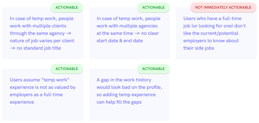
We had learned from anecdotes that many of our professionals have a "temp work" experience, though the data indicated only a small % of professionals adding this to their Instawork profile.

So we wanted to explore the possibility of capturing more accurate work experiences, because that's tied to the opportunities the professional gets on the platform.

Hypothesis validation

Survey

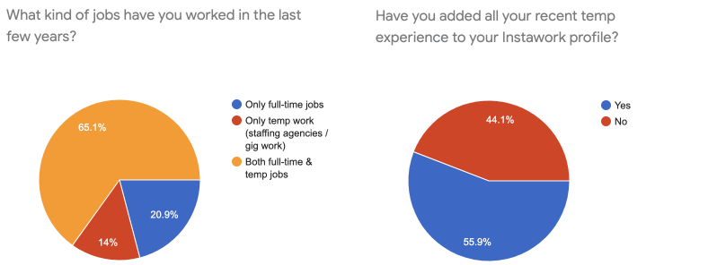
I ran a survey with our active professionals, to learn how many of them have a recent temp experience that's not added on Instawork.

💡 ~80% users have a recent “temp” experience, but only 56% have added them all to their Instawork profile

Error rate

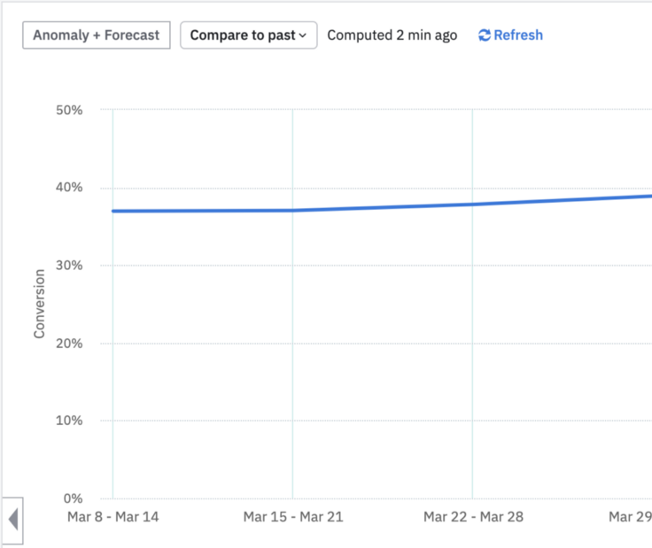
When I looked at the UI event data, I realized that the current UI has a bigger problem than just adding temp experience. Almost 40% of users encountered an error while adding their work experience.
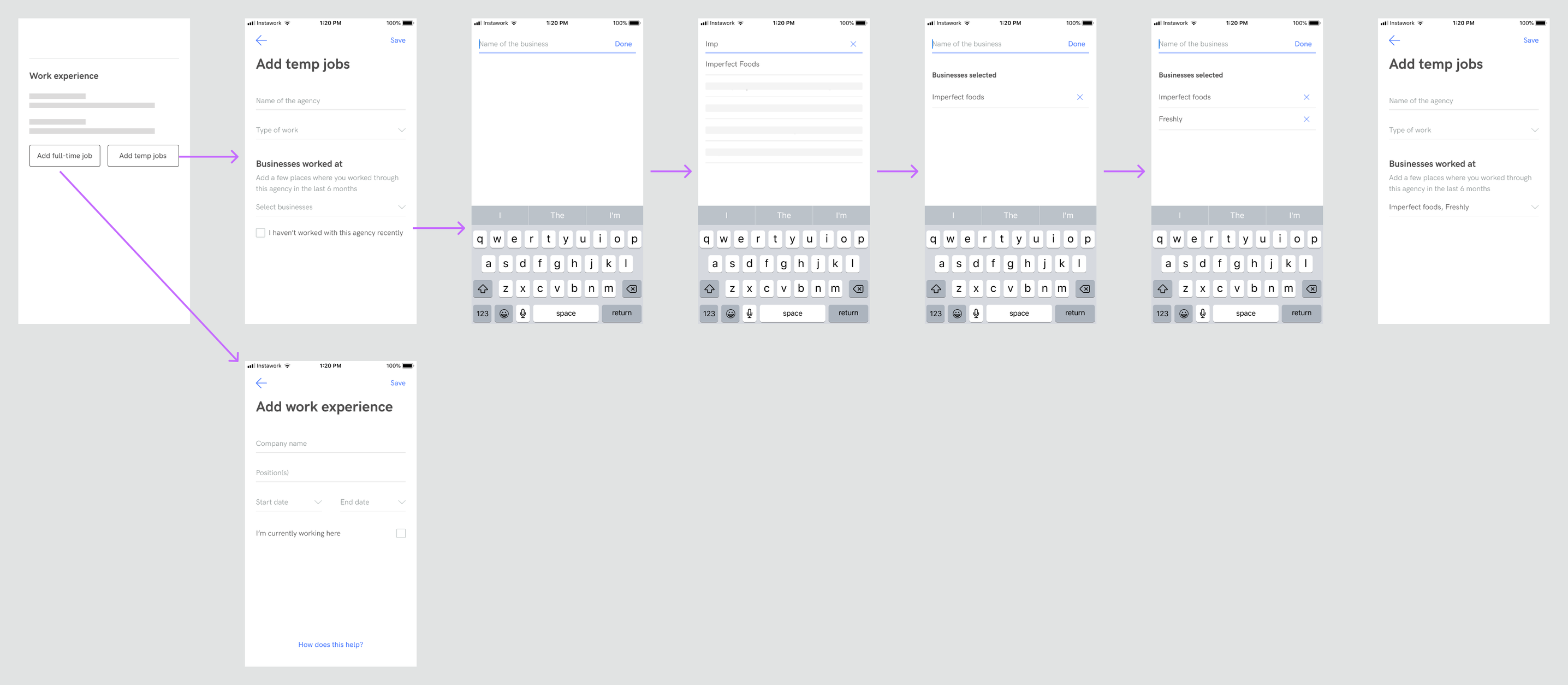
Current Experience

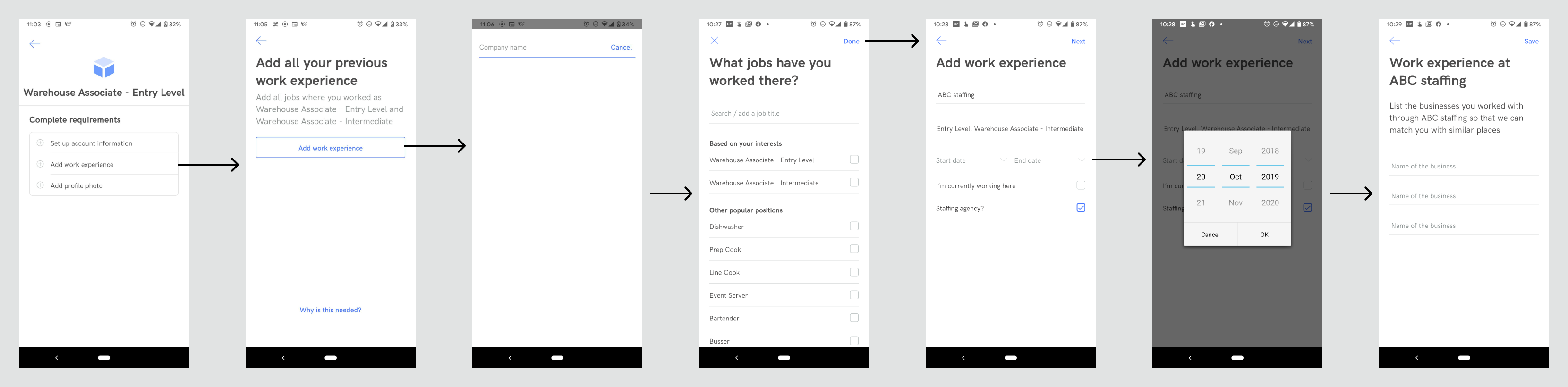
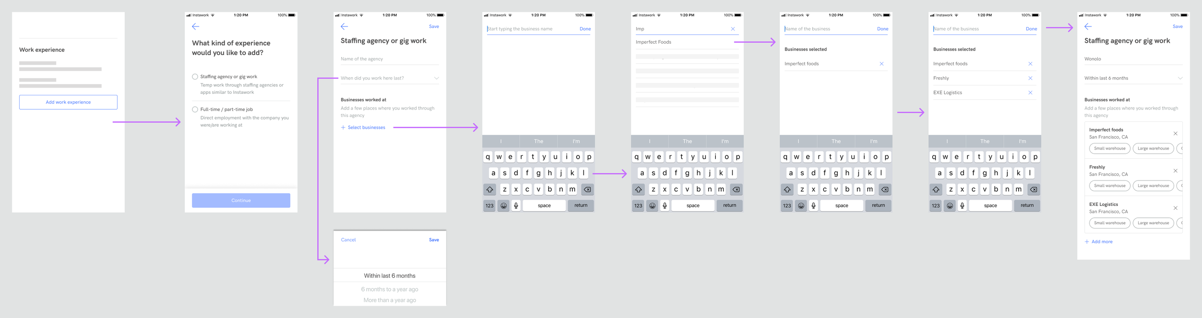
This is how the flow for adding work-experience looked like at that time:

Heuristic Evaluation

When I looked at this from the perspective of adding a "temp experience", some of the issues became quickly evident:

  • It’s not clear until you enter the company name and select job titles (3rd & 4th screens above), that temp experience is accepted too — that is if you notice the "Staffing agency" checkbox.
  • The description text in the second screen specifically asks for “where you worked as <position names>“, which could confuse/discourage pros from adding jobs where the job titles were different.
  • “Job title” signals a permanent employment, and the suggested options are all specific to what they're called on Instawork, which again makes this step confusing while trying to add temp experience
  • Start- and end-dates are not always relevant for temp work, especially if the work was spread across multiples businesses
  • The flow gets triggered conditionally depending on whether pro decides to add agency experience, because of which we might lose out on a significant amount of temp experience
  • It is not clear why staffing agency/temp experience is important and why pros should add these details, so it is likely pros don't add details as accurately as they can
  • The data about businesses worked at (last step) is not very structured
  • business name is an open text field so data collected is extremely unstructured
  • no way to identify ‘when’ the pro worked at the business (start and end date is tied to staffing agency and not the business)

Goal

  • Improve % of people adding work experience successfully

Design

Concepts

Based on what we had learned yet, I started with some broad design directions.

1. Upfront choice leading to different flows

2. Minor variation of #1, with the choice built into the same screen

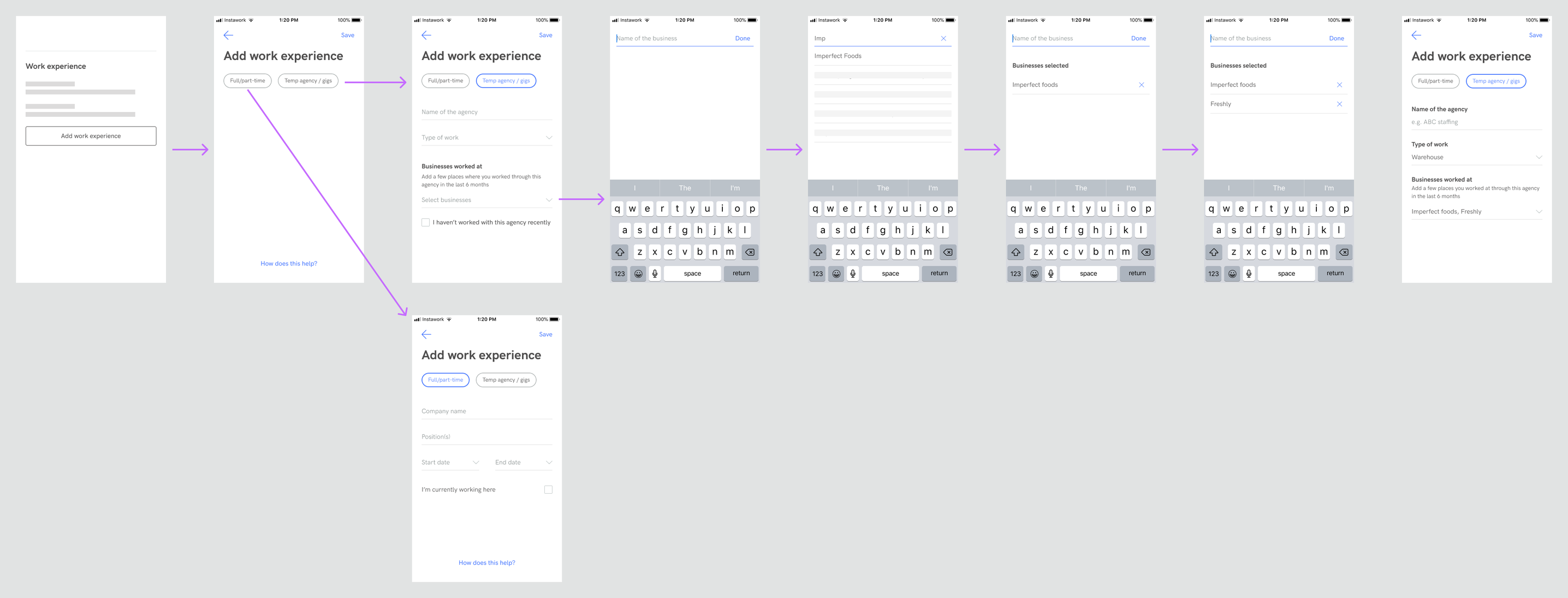
3. Conditional fields, split into one question per screen

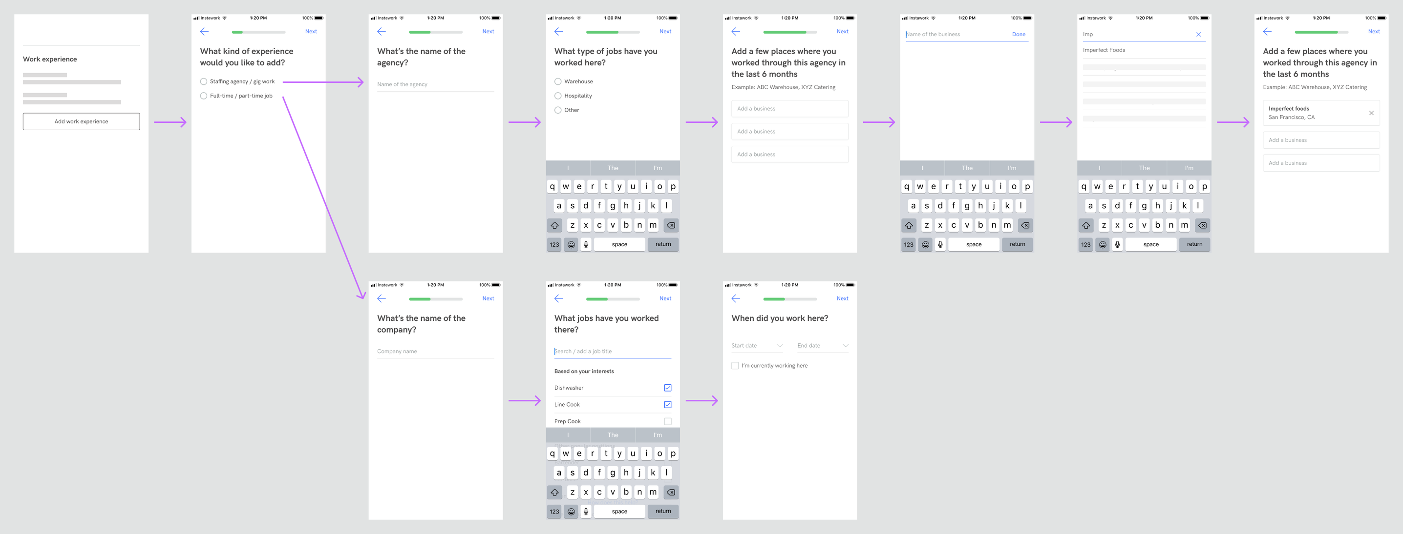
4. Common fields followed by bifurcated flow

User Research & Validation

While working on these broad designs directions, we also set up user interviews, so that we could learn how they think of temp experiences, and more importantly,

❓ Why aren't they adding their temp experiences on Instawork?

Detailed script for the interview can be found here.

💡 Insights

Design Direction

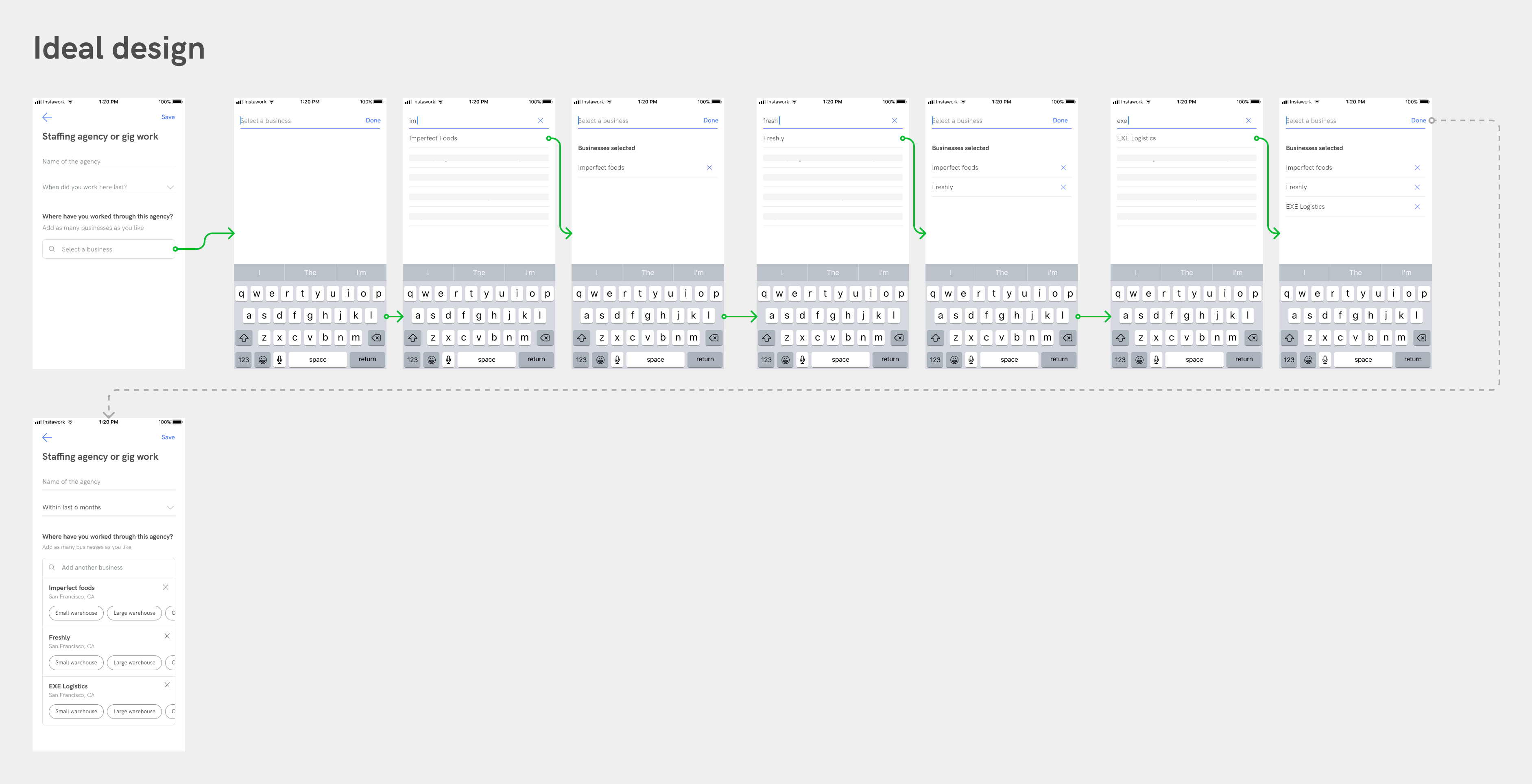
Based on the learnings above, we decided on this UI direction, with the considerations listed below:

Proposed design direction (low fidelity)

  • In the interest of the accuracy of the work experience, the design that enables adding as many businesses as possible quickly is preferred.
  • The set of information to be captured for temp experience and full-time experience have very little overlap, so the flows can be separate.
  • Agency is top of mind for pros, even though we care mostly about the business they worked with. So starting with the agency name can help set context for adding businesses.
  • Type and size of the business are more valuable to be captured for each business than for each agency.

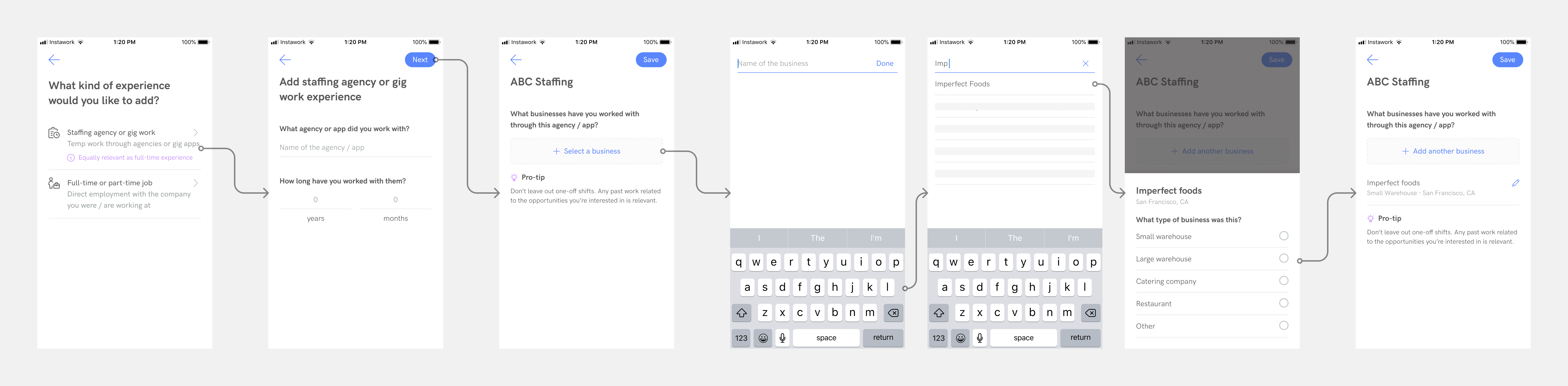
Implementation & Iterations

We quickly hit a roadblock when we took the design to engineering. The UI to add multiple businesses under an agency would require a huge revamp of some existing components, which we could not afford at the time.

This meant that the user would have add the businesses one at a time, going back and forth between the screens.

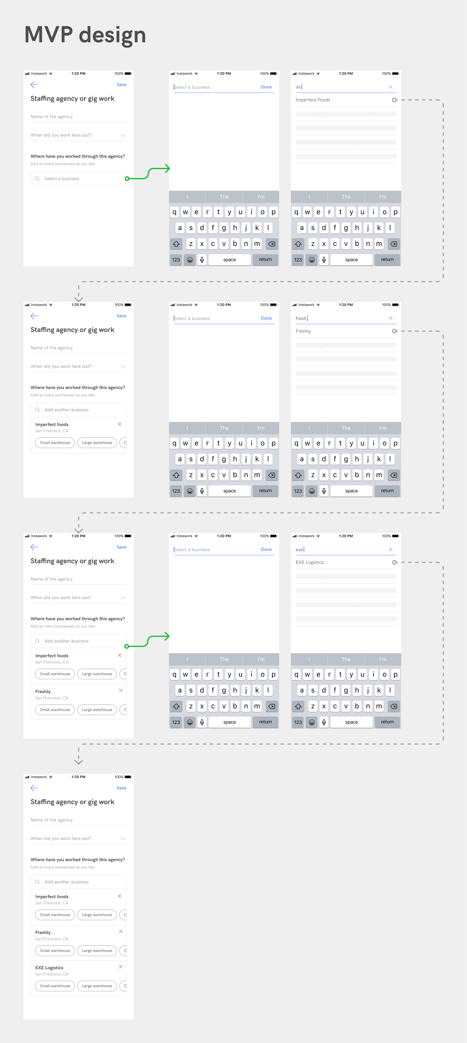
We rolled out the MVP, while we explored alternative designs that can achieve a similar experience with smaller engineering changes. So the new design challenge was to:

🎯 encourage users to add all the businesses they worked at, and not stop at one

Plus, another requirement that came up from operations team was to

🎯 collect how long they worked with the agency, not just when
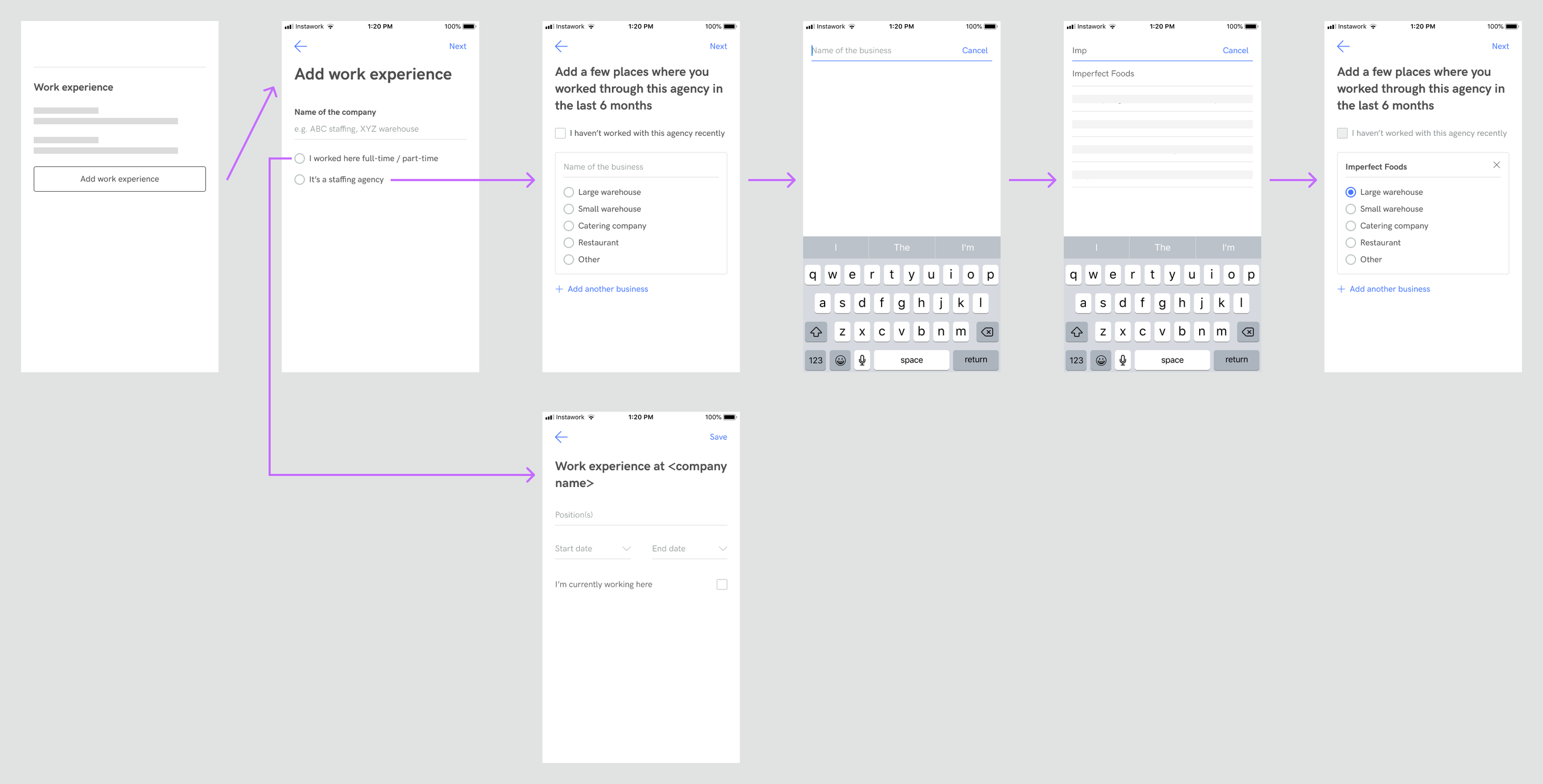
Usability test

Prototype

https://www.figma.com/embed?embed_host=notion&url=https%3A%2F%2Fwww.figma.com%2Fproto%2FZFUtpks0WGQ2E5sygNSQvM%2FTemp-experience-proto%3Fnode-id%3D131%253A4990%26viewport%3D1550%252C679%252C0.5828413963317871%26scaling%3Dscale-down

Learnings

  • The business field was missed by many users, leading to error states
  • Same happened with the business-type selection as well
  • The pill UI to select the business type was making users anxious as they were not sure if the selection would be saved when they go on to add another business
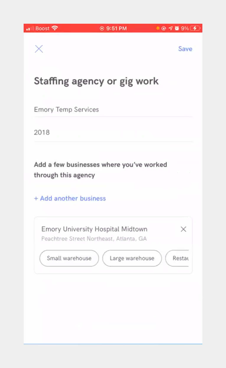
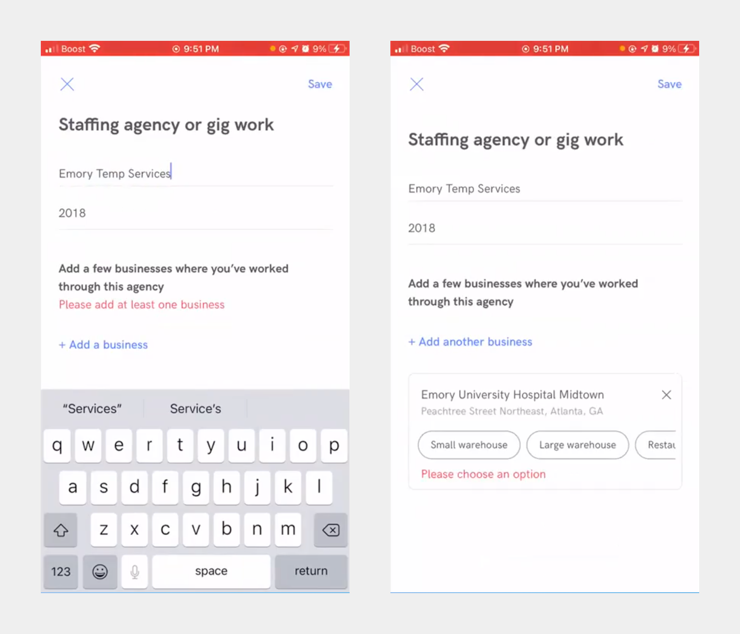
Final design

While we were not able to support adding multiple businesses in one shot because of engineering limitations, there are two things we did, to achieve the above goals:

  • Split the form into a 2-step flow, with "adding businesses" having it's dedicated step, which helped by
  • adding more emphasis to this step
  • facilitating additional elements like pro-tip
  • Brought the business type selection into a continuous flow (which was done earlier through the pills)
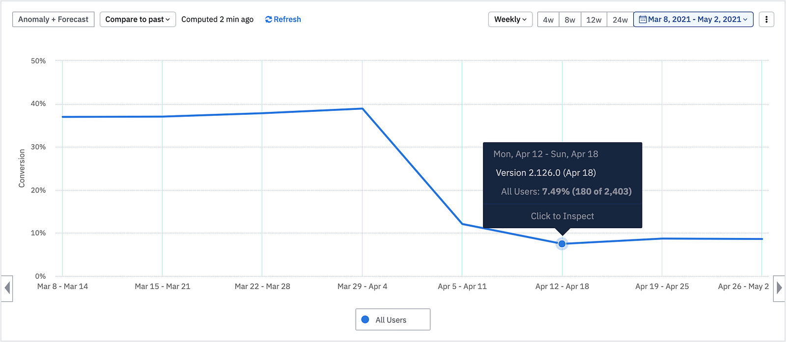
Results

After the final design was rolled out...

1. Error rate reduced by ~80% (from 37% to 8%)

https://cdn-images-1.medium.com/max/1600/1*HZI6ExznjXj4RZGuZb0q-w.png
Scroll to top